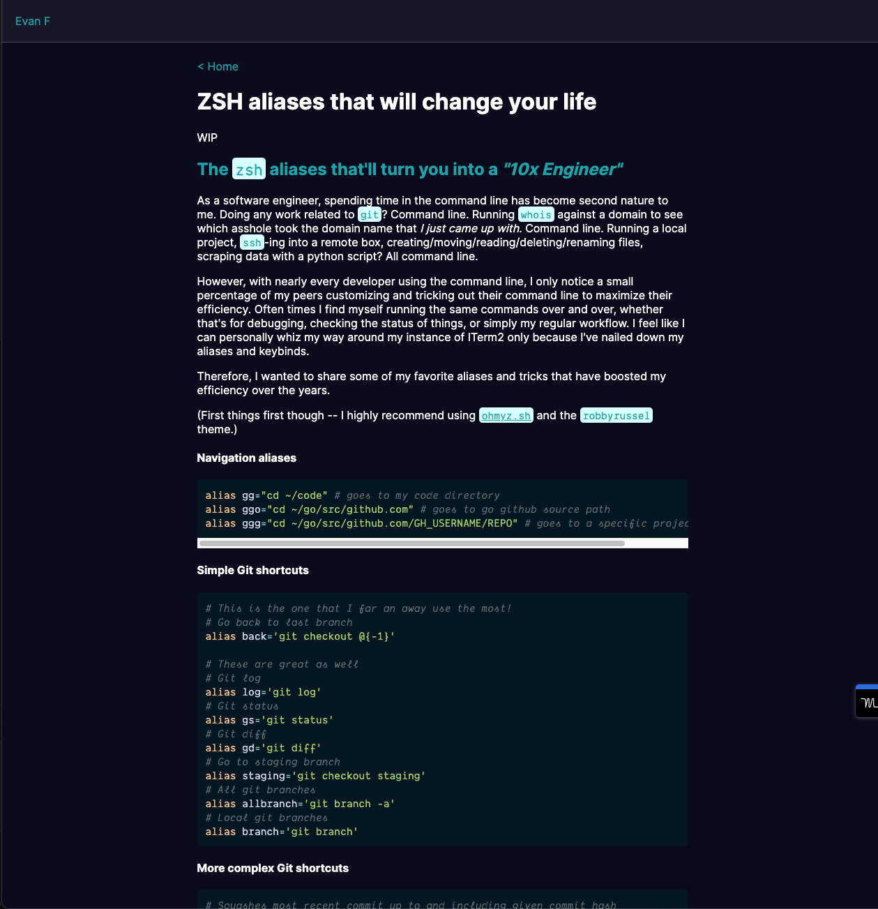
A much-needed facelift
About a year ago, I found Next.js and Vercel and immediately wanted to rebuild my personal site on it. Building it out was super fun! I followed the Next.js tutorial and had a blast learning the languages, not to mention the newfound power of using MDX to easily create blog posts and web pages — which before would have easily taken far more time wrapping everything in <div>s and formatting it all nicely.
However... the final result a year ago left much to be desired. I wasn't happy with how it looked and felt, which is probably why I only wrote one real post over the past year.

It was honestly pretty bad. I chose some whack color scheme, the <code> elements were styled poorly, the blog posts themselves did not have reader-friendly formatting, and, perhaps most egregiously, there was no light/dark mode toggle.
So I decided I would clean up my personal site and make it a place where I would be proud to publish random thoughts and articles in perpetuity. After all, if I am a full-stack (frontend leaning) engineer, my personal site better be goddamn beautiful.
A few weeks prior to revisiting it, I finally tried out TailwindCSS while hacking on a side project. The delay for trying out Tailwind came from an association of Tailwind to Boostrap. 5 years ago, I tried out Bootstrap and absolutely hated it. Bootstrap did not interface well with React, and I was unable to customize my components with surgical precision. For at least a year up until this point, I had wrongfully classified TailwindCSS in the same bucket as Bootstrap — and boy was I wrong.
TailwindCSS made it so freakishly easy to whip up a new UI, with so meany great features coming right out of the box. Dark mode toggling, typography, lovely mobile responsiveness.
Within a few hours of hacking on my personal site, which was previously built with theme-ui, I had a refreshed UI made with Tailwind and looking fly.
I'd like to take a moment to note as well that I was heavily influenced by Lee Robinson's beautiful personal site while building this updated site.
So alongside bringing the UI up to speed with TailwindCSS, I massaged the blog post typography to my liking, added in a new code block theme (Material Oceanic, which I use in Webstorm!)m abd whipped up and About page that has a neat timeline about all the cool shit that I've done over the years 😄
So now that this site is updated, I definitely want to start putting my thoughts and learnings down, so that I can spread the knowledge with yall!